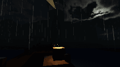
How a Restrained Colour Palette Sets the Mood in Horror Games
In horror games, a restrained colour palette does more than set the scene, it crafts the very mood and tension players experience.
The Emotional Impact of Colour
In the realm of horror games, colour serves as a silent yet potent tool. A meticulously chosen palette influences a player's emotions, drawing them into the dark, foreboding world the game creators have designed. By limiting the range of hues, developers can intensify feelings of isolation or fear. Muted tones like greys, deep blues, and shadowy blacks often dominate these settings, acting as a psychological cue that danger lurks around every corner.
Take a moment to reflect on famous horror titles. The use of colour is rarely arbitrary. Bright, saturated colours are generally avoided to maintain suspense and unease. Instead, the restricted palette echoes the eerie silence and tension that the genre thrives on. Colours in horror games are not merely aesthetic choices; they are essential components of storytelling and player experience.
Palette as a Storyteller
A game's colour palette does more than evoke an emotional response, it tells a story. Colours can signify different themes, emotions, and transitions. In horror games, the subtle shift from a cold blue to a sickly green might indicate the player's descent into danger. Such transitions guide the player, often subconsciously, preparing them for the narrative twist or emotional climax.
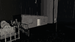
In our gallery, you can see how games like 'The Lighthouse Keeper' utilise a cohesive palette to narrate the protagonist's journey through despair and eventual revelation. The use of earthy browns and washed-out greys not only underscores the desolation of Cape Mourn but also mirrors the character's internal struggles. This strategic use of colour strengthens the narrative, offering visual cues that enrich the storytelling without relying on explicit exposition.
Historical Influence on Palette Choice
Historical settings in horror games often dictate the colour palette. Games set in past eras draw from the visual tone of those times. The Lighthouse Keeper, set in 1971, incorporates the muted, earthy tones prevalent in the period. This choice not only brings authenticity but also enhances the atmospheric dread associated with its maritime setting. The past itself becomes a ghost, haunting the players through the washed-out imagery that characterises the era.
Exploring these settings reveals how historical accuracy in colour can deepen immersion. It acts as a bridge, connecting players to the world of the game and the unease that permeates its narrative. This connection is evident in games that rely on real-world inspirations, where adherence to the visual norms of the time intensifies the player's engagement.
Case Study: The Lighthouse Keeper
'The Lighthouse Keeper' serves as a prime example of how a restrained palette can enhance horror. The game's visual design employs a palette of sea greens, stormy greys, and rusty reds. These colours reflect both the harsh coastal environment and the underlying menace that pervades the story. Each hue is carefully chosen to evoke the isolation and trepidation that defines the player's experience.
"Every colour tells a story, and in horror, it whispers of dread."
Within the game, the consistent use of these colours builds a cohesive sense of place. As players navigate the labyrinthine corridors of the lighthouse, the atmospheric palette keeps them grounded in the world, reinforcing the themes of solitude and mystery. The effect is a seamless blend of visual storytelling and emotional engagement.
To learn more about the specific techniques used in 'The Lighthouse Keeper', visit the game's story page.
Consistency in Design
Consistency in colour palette design is crucial for maintaining immersion. A disparate range of colours can break the tension, pulling players out of the moment. By maintaining a tight palette, games like 'The Lighthouse Keeper' ensure that visual unity supports thematic cohesion. This approach not only crafts a more believable world but also keeps the player emotionally invested, allowing the horror to resonate more deeply.
For developers creating horror games, the lesson is clear: a well-considered colour palette is not merely decorative, but an essential narrative device. It shapes the atmosphere, guides the player, and magnifies the emotional impact of the game. By understanding and utilising this tool, developers craft experiences that linger in the minds of players long after they have left the haunted shores of Cape Mourn.
If you have any questions about our design choices or want to discuss further, feel free to contact us.